GHoST LIGHT COMMUNITY THEATRE*
LOGO AND BRANDING DESIGN, *Student Project
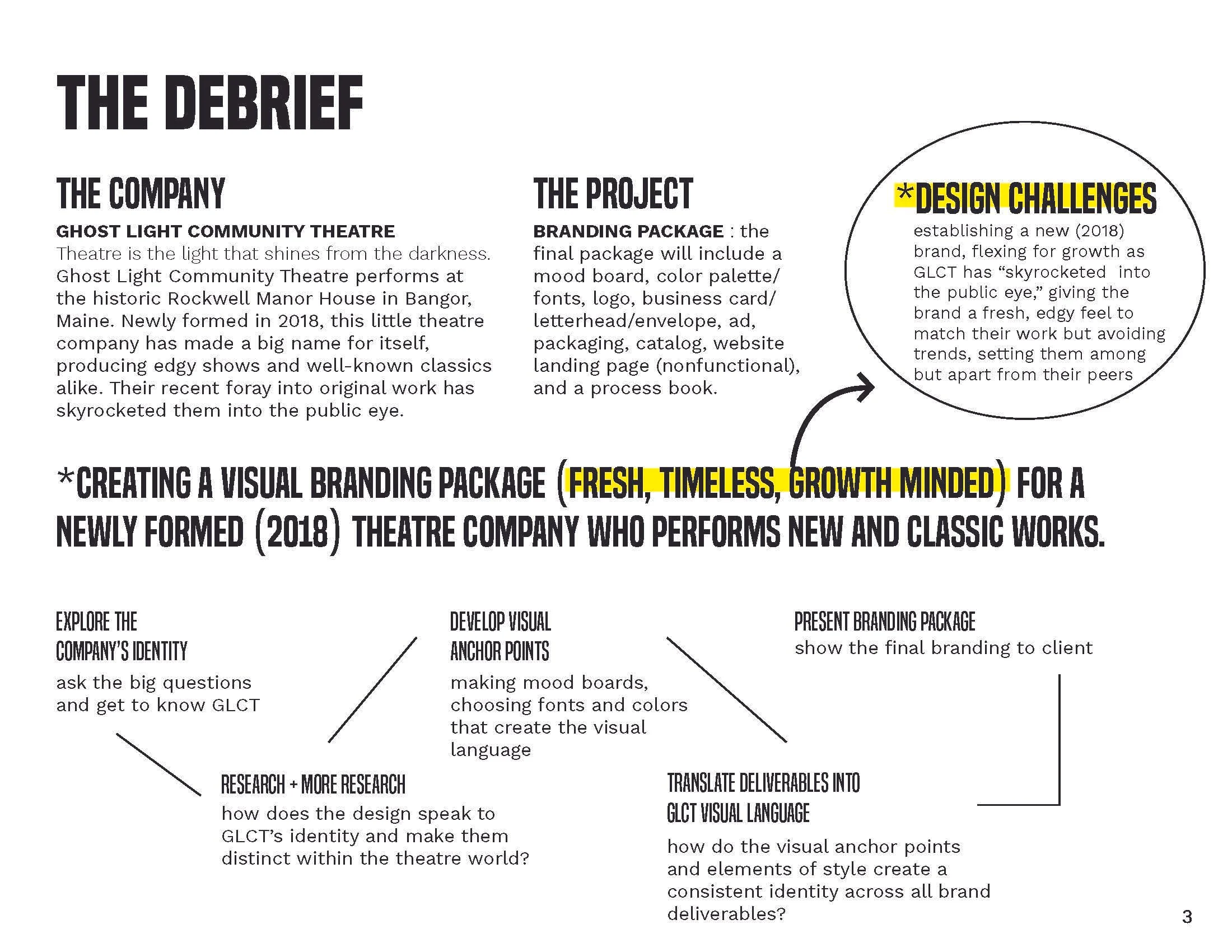
The Brief
Create a new branding package for Ghost Light Community Theatre, a small theatre company in Maine, based on the company’s tagline “theatre is the light that shines from darkness.” The branding package will include a new logo design, complete corporate stationery suite, a unique package design, catalogue, and advertising.
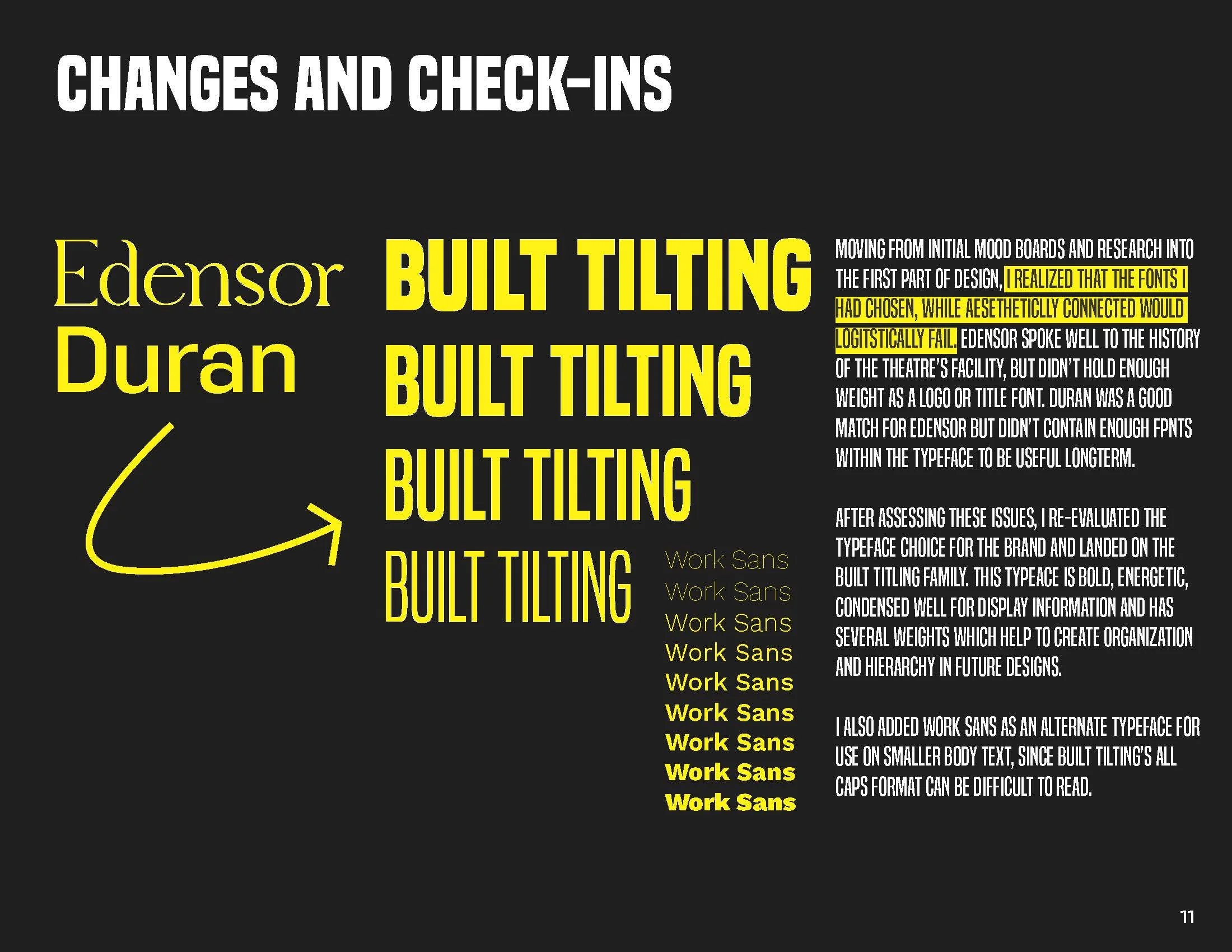
THE BEGINNING.
The project’s design launched from the theatre’s existing name and tagline. A “ghost light” is the single bare bulb left on stage to illuminate a theatre and orchestra pit for the safety of production crew who work before house lights are turned on. This visual, accompanied by the theatre’s tagline “theatre is a light that shines in the darkness” inspired me to work in a limited color palette, black, white, and yellow and use negative space to represent light piercing through darkness throughout the overall design.
The process
-
The process -
CONCEPT
Beginning with influences from broadway to signature stamps to the human fingerprint, I set out to design a unique and easily recognizable brand identity.
Typography
Choosing bold typography that commands attention helped ground the brand in trust while exploring modern sensibilities.

Design
The design process expanded the new branding foundations over a complete suite of printed and digital marketing collateral.
Spotlight
The final branding campaign allowed Ghostlight Community Theatre to re-introduce themselves as a major player on the stage of modern theatre.
THE LOGO
The logo mark is illustrated around the concept of how light, such as that from a stage ghost light, gradually travels outward from it’s source, combined with the visual language of a fingerprint, speaking to Ghost Light Community Theatre’s focus on new and original works.
-
![]()
Project Debrief
I started by analyzing the brief and company needs for the project.
-
![]()
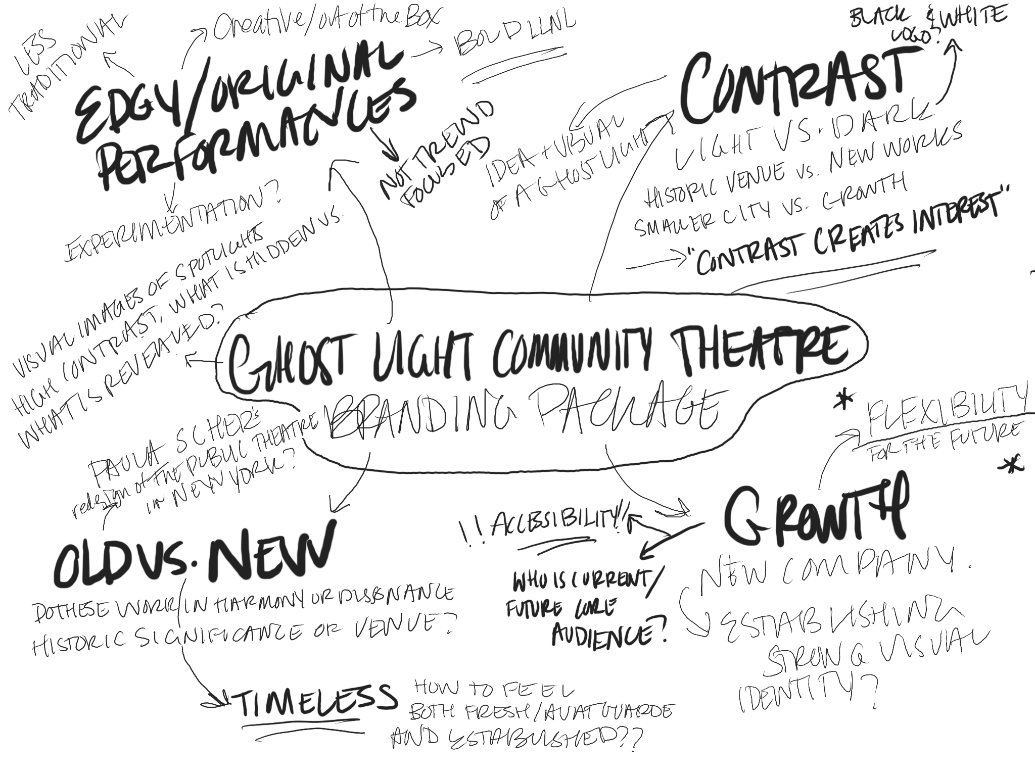
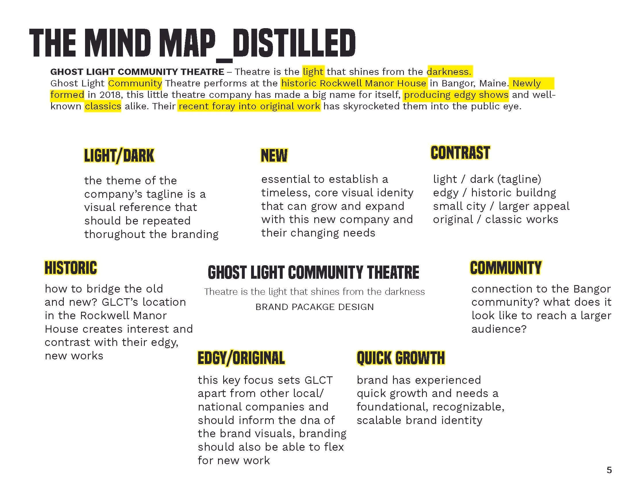
Mind Map_ Distilled
After debriefing, I moved into creating a mind-map of concepts and key touch points that should connect throughout the design.
-
![]()
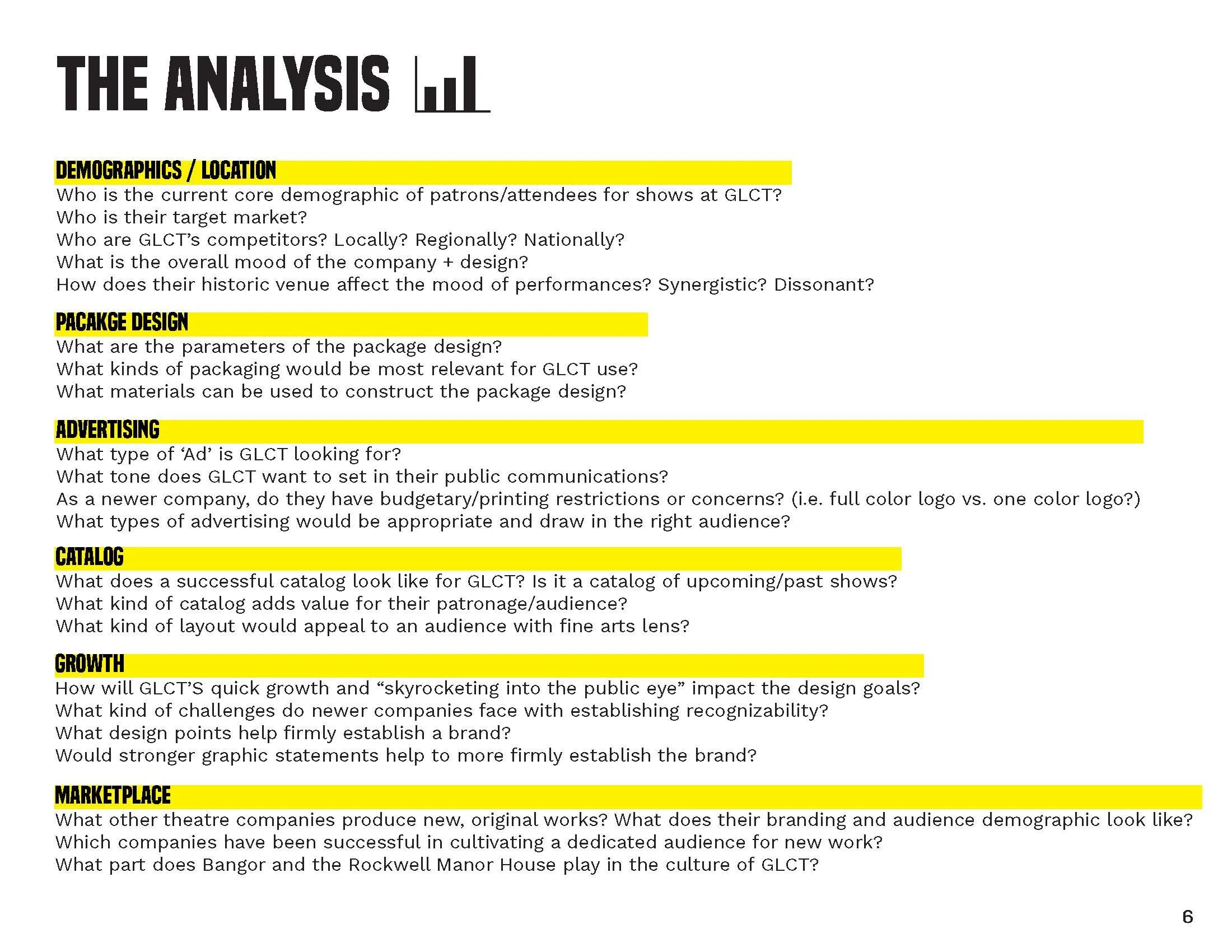
Analysis
General mind-mapping ideas gave way to analysis questions that would guide my market and demographic research.
-
![]()
Synthesis
I then synthesized and polished initial ideas to highlight my priorities as I moved forward in the design process.
-
![]()
Research_01
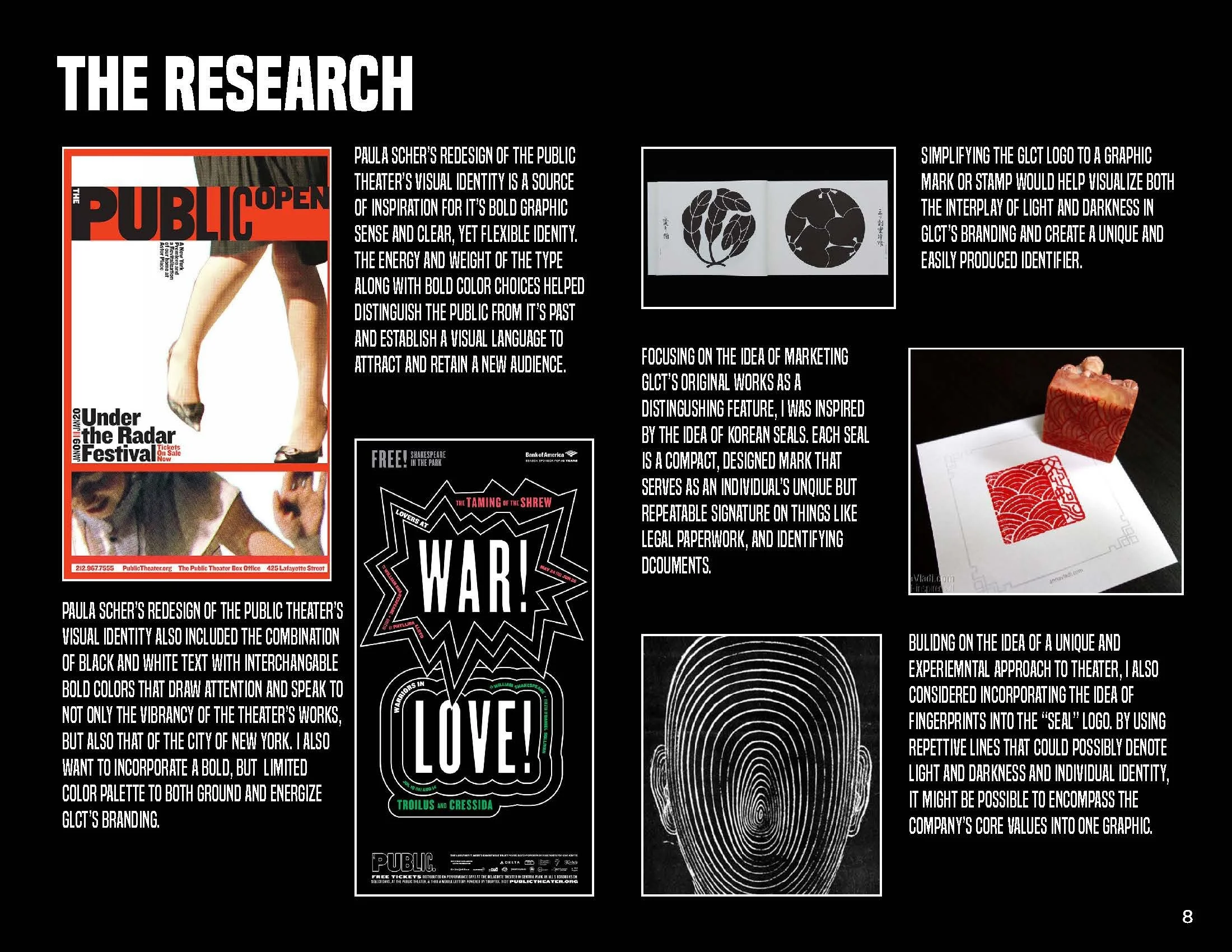
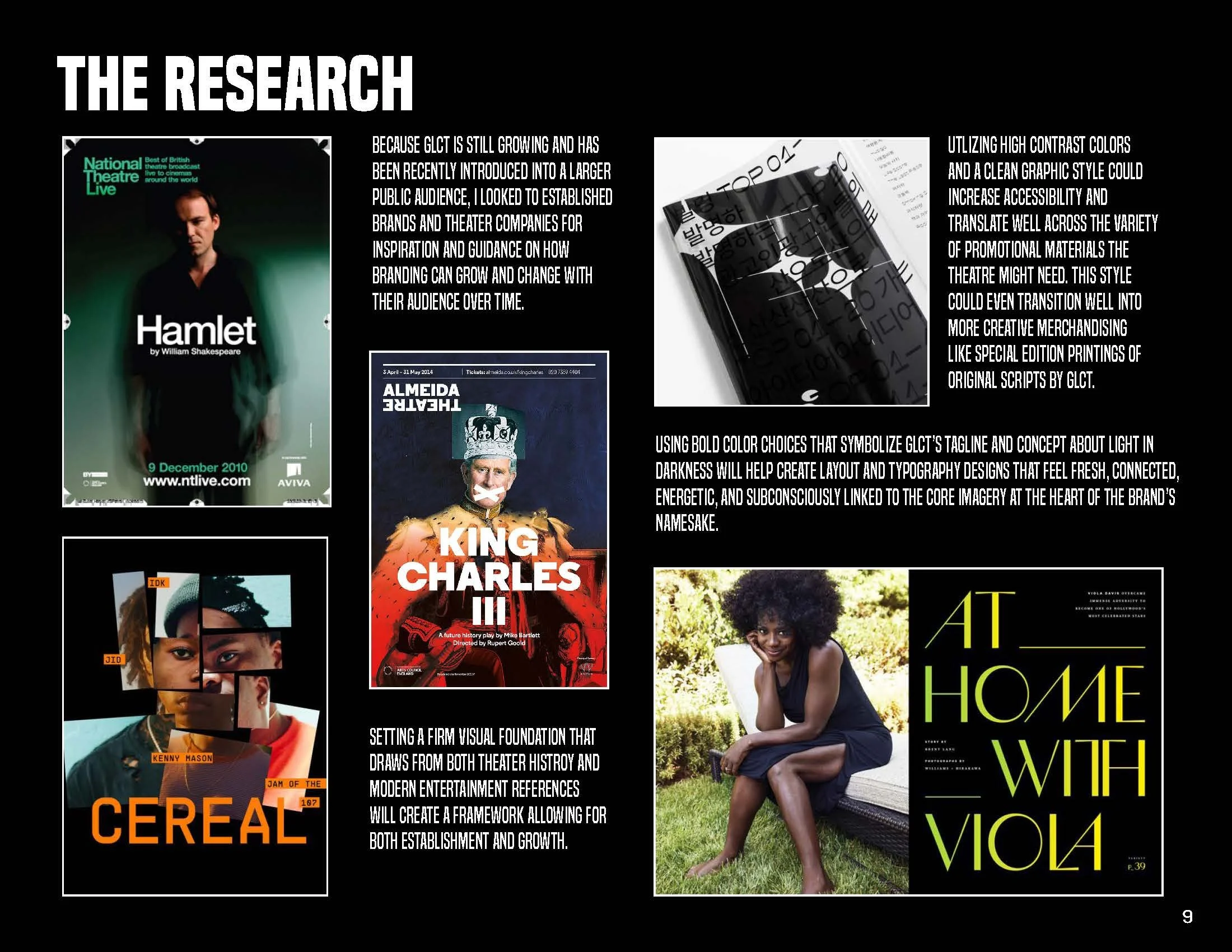
I began researching competitors and peers to GLCT along with visual references that might help tell their brand story and capture the attention of their core demographic.
-
![]()
Research_02
My research led to gathering varied design inspiration from broadway and the west end, as well as magazines, print ads, signature seals, lighting design, and even human fingerprints.
-
![]()
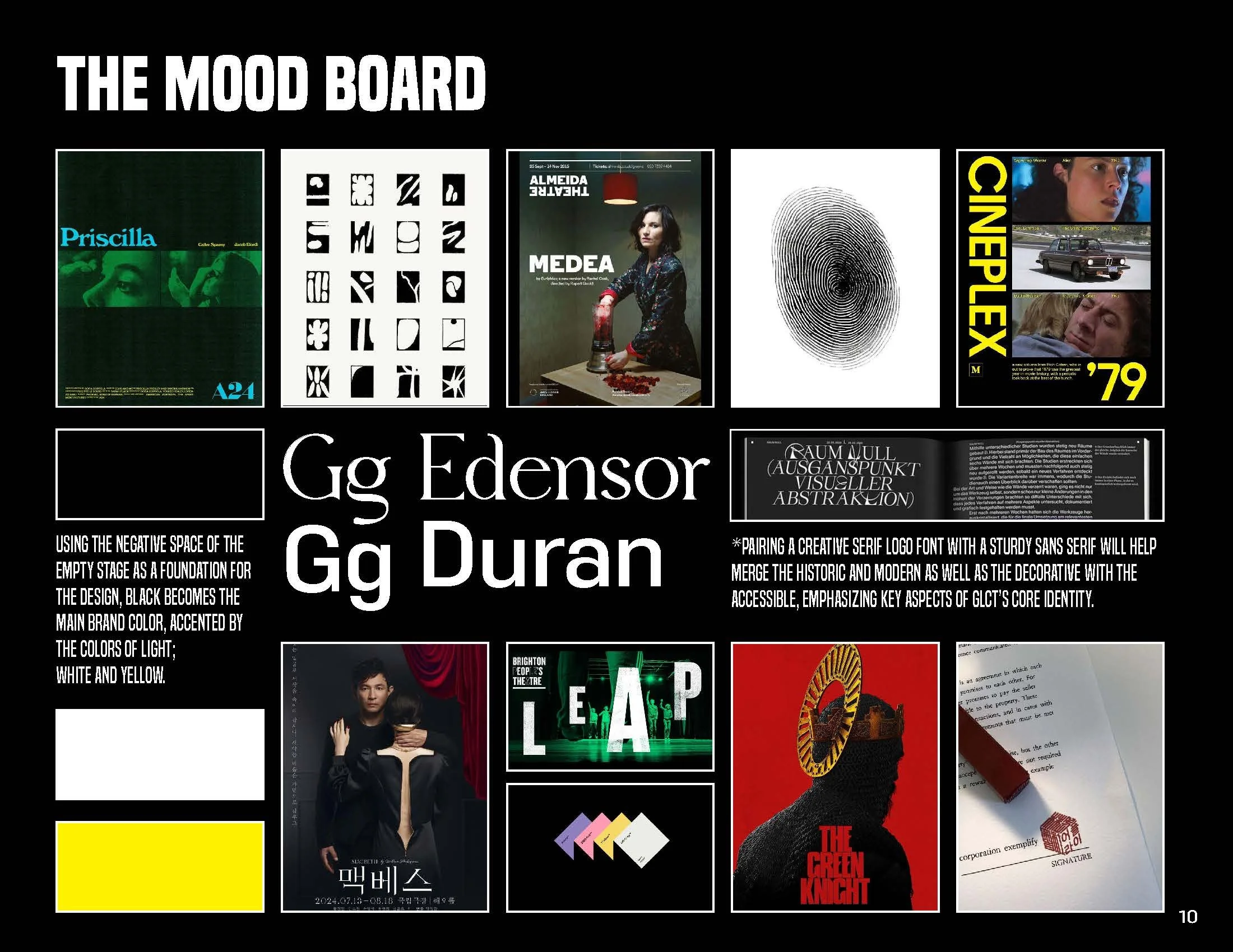
Mood Board
My research culminated in a final mood board that I could present. This mood board distilled the core of what I intended to highlight in the brand’s visuals emphasizing a bold yet recognizable color palette, modern graphic elements, and a unique hand drawn logo mark inspired by their tagline.
-
![]()
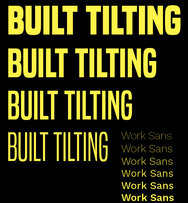
Type Design
After reviewing the mood board, I utilized initial feedback to refine typography choices and logo details before moving forward to start design.
-
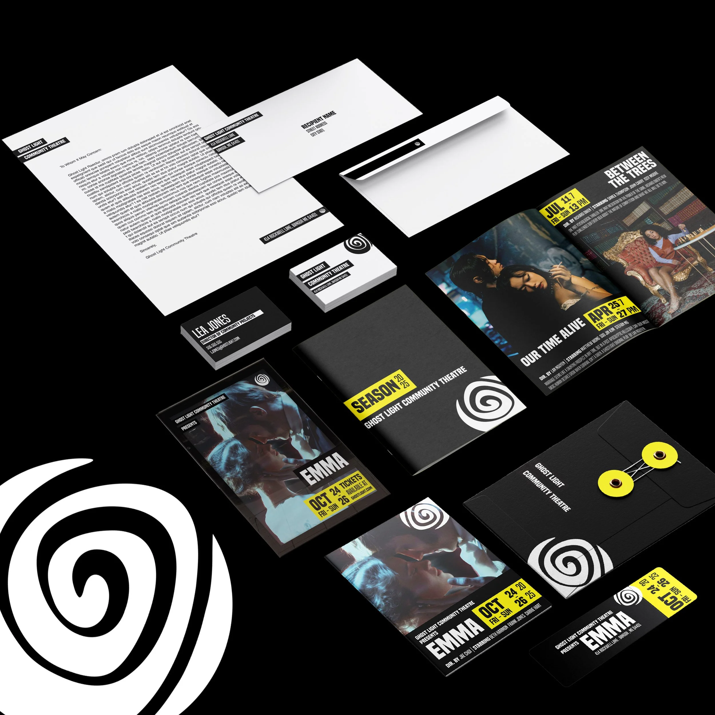
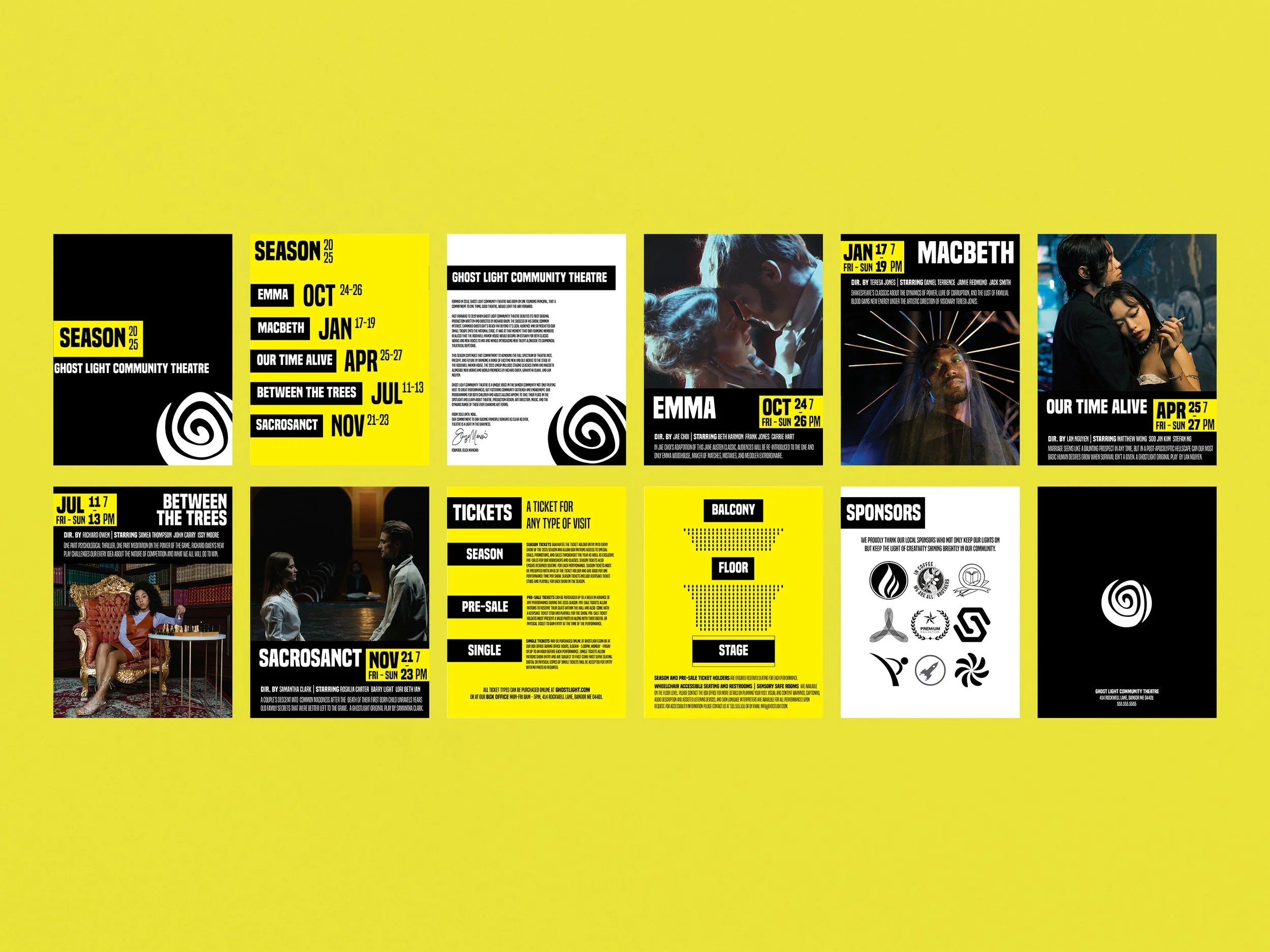
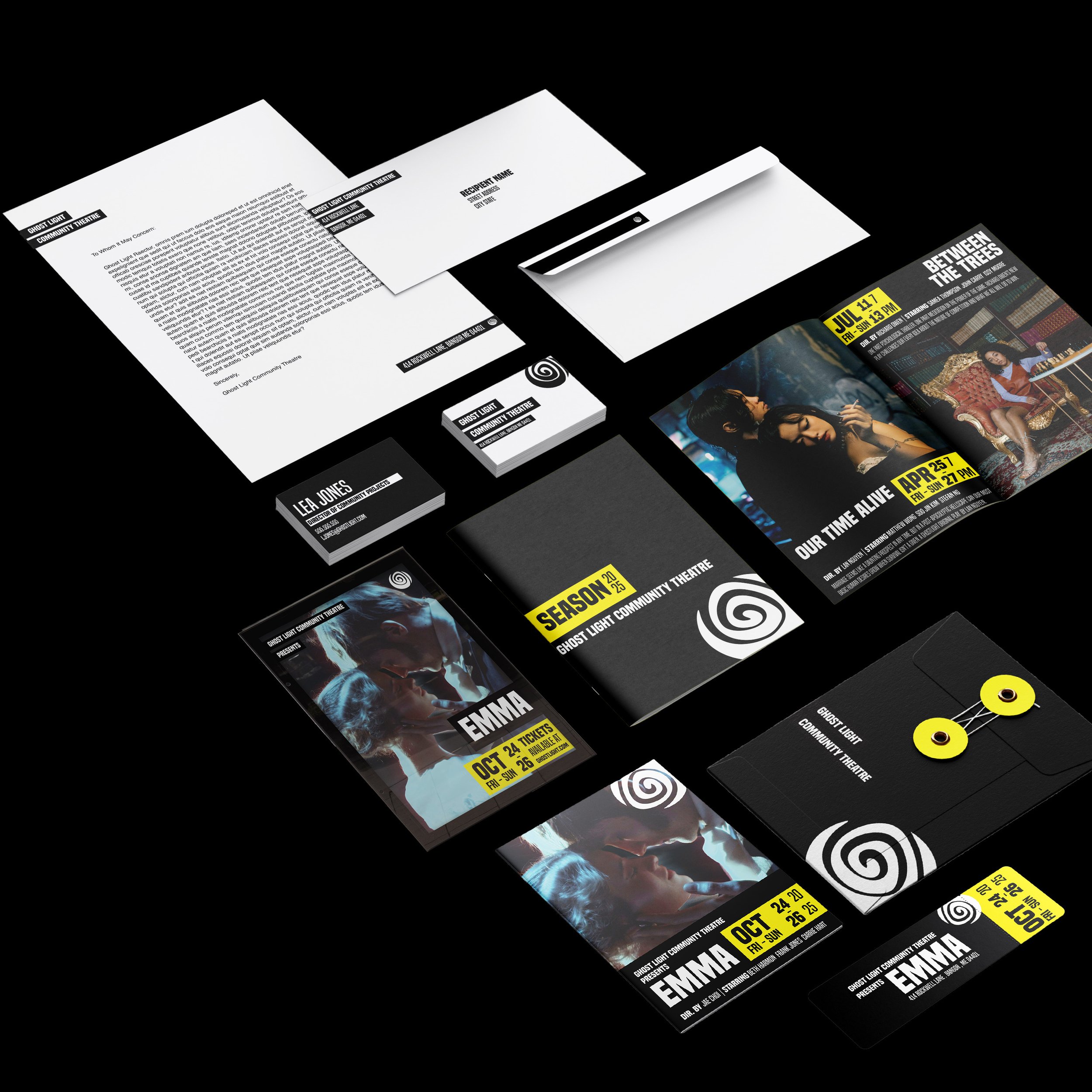
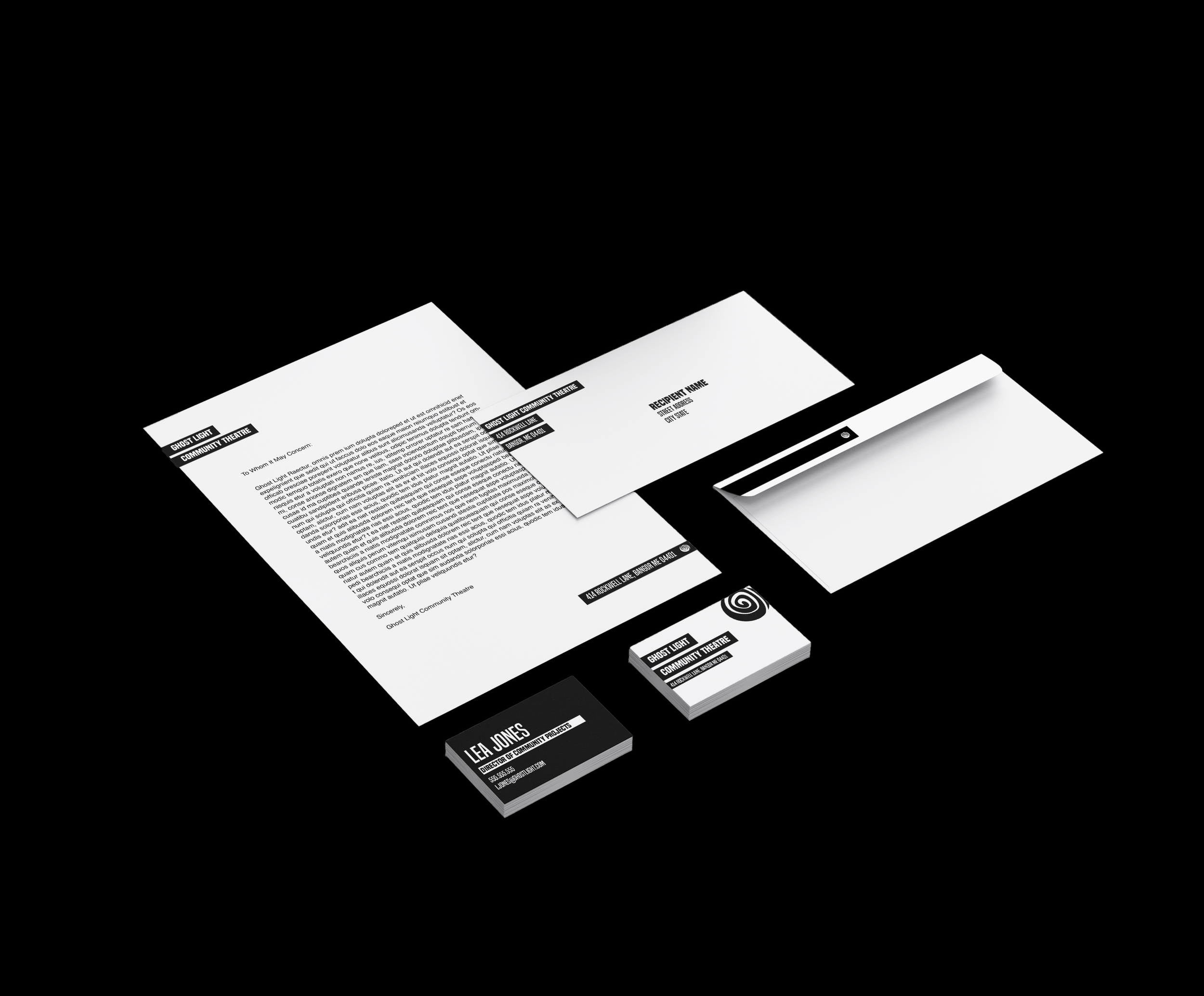
The corporate stationery utilizes the black box full text logo as its starting place. The graphic lines of the box help draw attention to important company information, but also serve as a frame for memo text on the letterhead. Keeping the corporate stationery in black and white not only simplifies the design but also lowers printing costs on items that will be regularly printed in bulk.
-
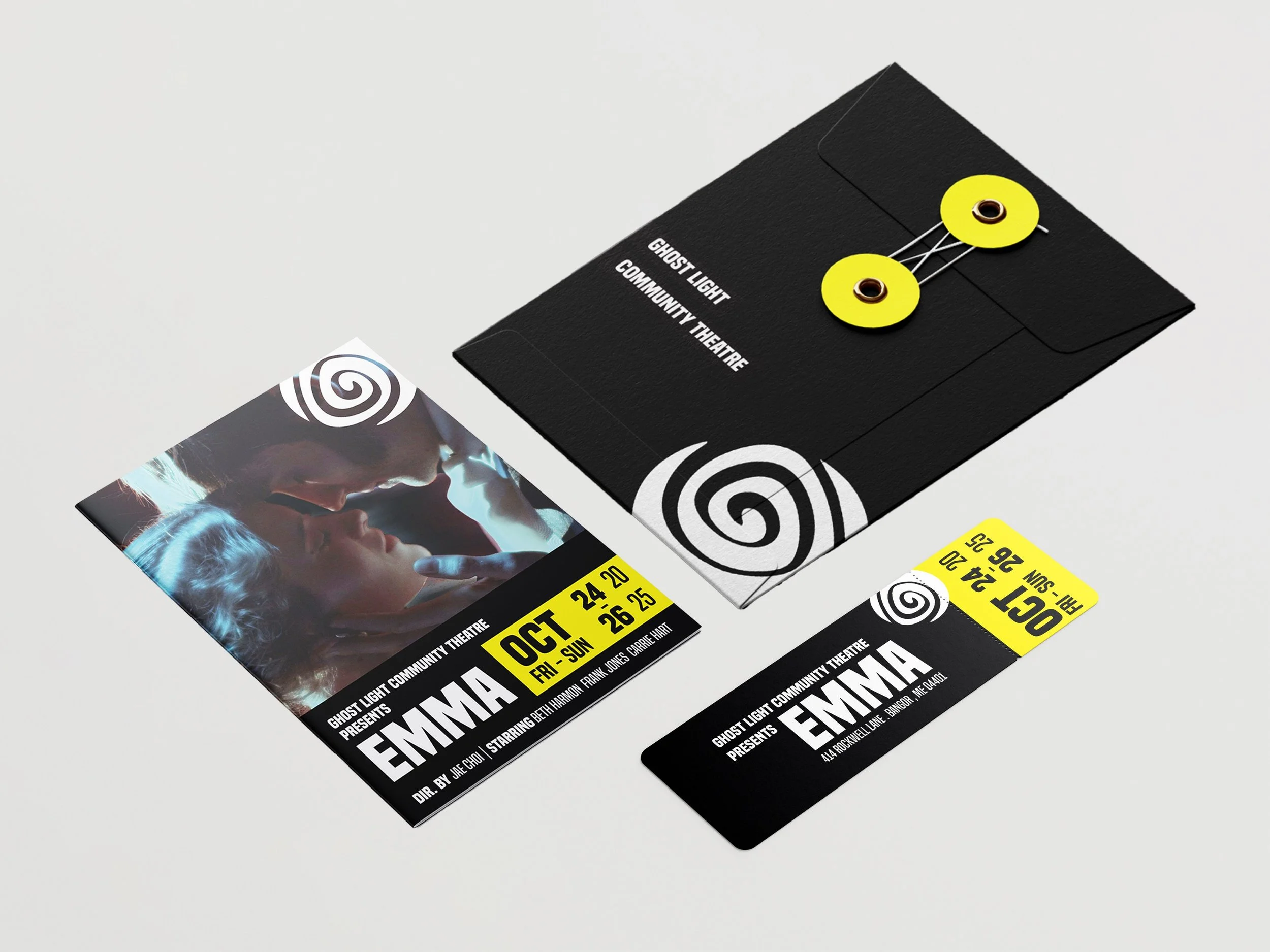
The Package design scales the branding principles from a macro audience to a personal level. When Ticket holders recieve their packaging in the mail, I wanted it to feel cohesive and special.
The packaging consists of a branded envelope, special edition playbill and keepsake ticket that not only grants the ticket holder access to the show, but can be saved as a collectible item.
My initial sketches played with the idea of an envelope that unfolded to reveal the ticket inside or became a souvenir poster.
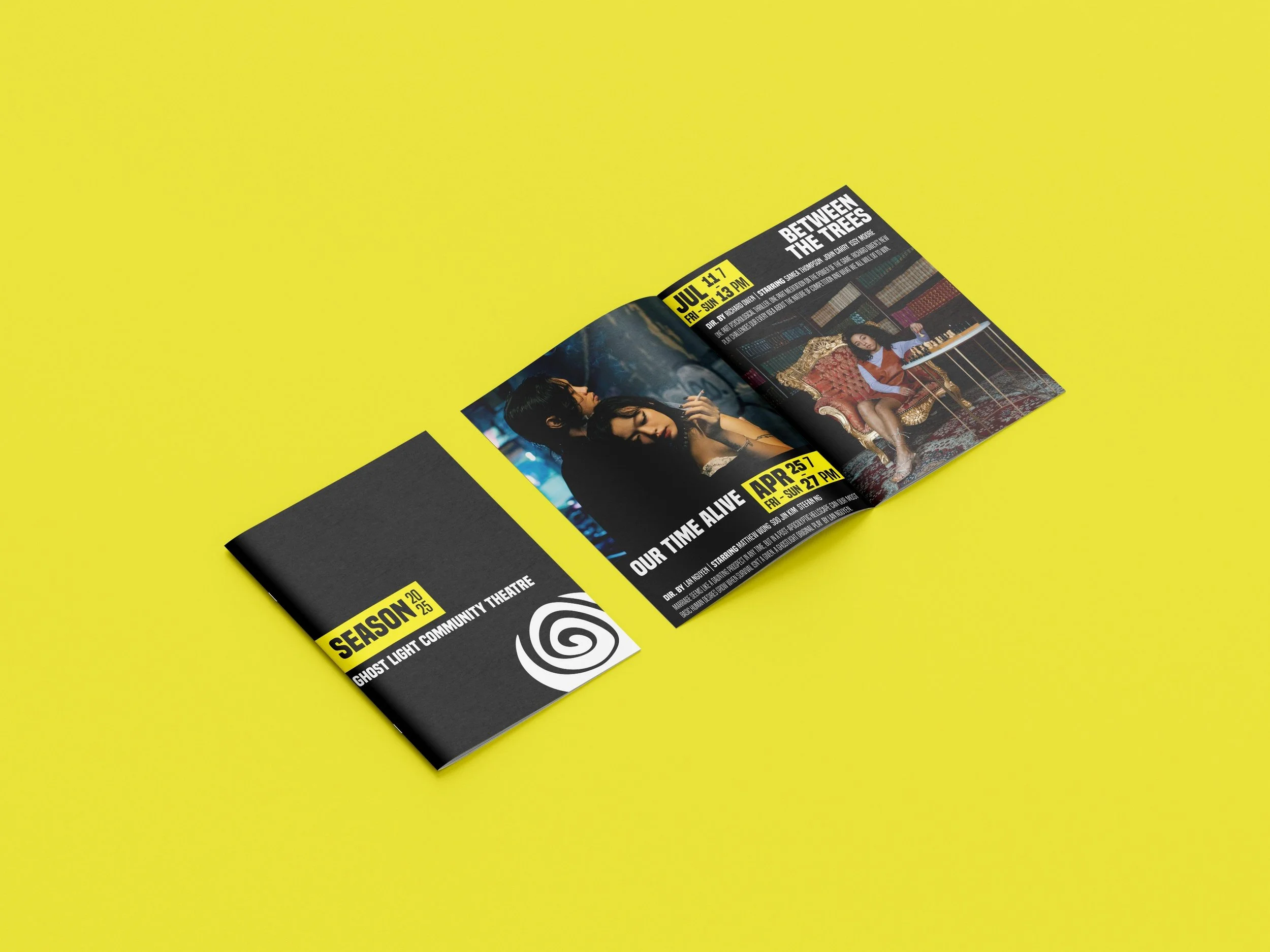
The specialty playbill design is built off of the advertisement and catalog designs, where the text block at the bottom remains consistent and the hero image changes depending on the show, creating consistency as a potential collectible item. The text block is also inverted from the position of the text on a traditional playbill and roughly influenced by cinema posters, including director and main cast information on the front cover.
-
I wanted the catalogue design to speak in the same visual language as the package mailer, by co-opting the playbill format for the upcoming show pages. By using the accent color consistently on informational pages, I hoped to create a design that felt energetic yet clear to encourage potential audience members to engage.
The catalogue’s design also speaks the established visual language of the playbill, building on what theatre goers have already come to expect from promotional materials.
By incorporating pieces of the expected into promotional materials, GLCT feels established, trustworthy and plugged into its industry, but also retains its own unique voice, speaking to GLCT’s desire to move theatre forward with original work.
-
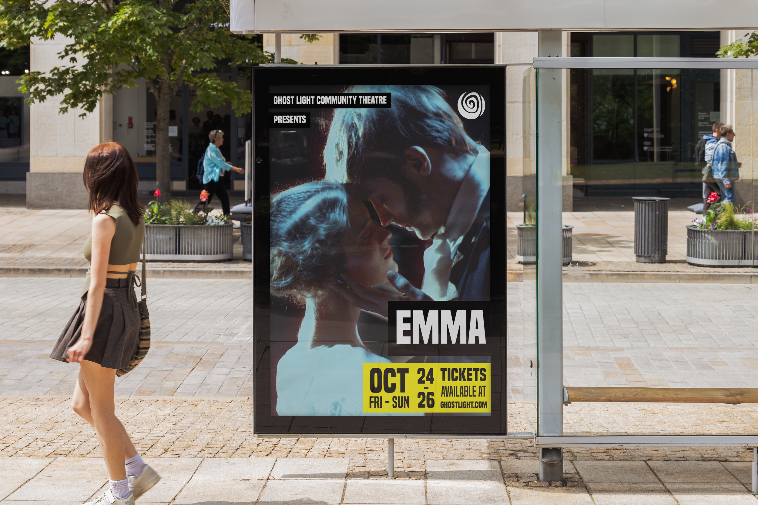
Following norms for the market, I designed a six sheet size advertisement poster for public spaces such as a covered bus stops or subway platforms.
This format focuses on large hero images, bold text, and hierarchy designed to accent important information. This design format is also used to create brand consistency over time. By subbing out the image, title, and date information for future shows, while keeping the overall format the same, it reduces promotion prep time and creating a recognizable visual language with the public.